Power BI Dashboard
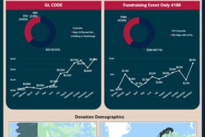
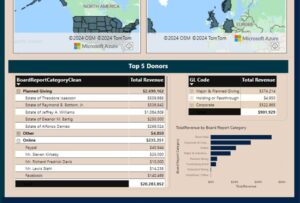
We’re updating a Power BI dashboard to make it more interactive and look better, keeping all the original filters. We’ll start by checking the current dashboard to see what can be improved. Our main focus will be adding buttons for easier use and scales for better data filtering, along with making the design look modern and professional.
Kreadevs.
Starting with your current Power BI Dashboard
Starting with your current Power BI dashboard, you can enhance the user experience by incorporating interactive buttons for navigation and data filtering. Additionally, consider implementing sliders or dropdown menus for more intuitive filtering options, and utilize modern design elements such as clean layouts, sleek fonts, and vibrant colors to enhance visual appeal. Don’t forget to maintain consistency across the dashboard to ensure a seamless user experience.
- Clients:
- Category:
DATA ENGINEERING - Date:


